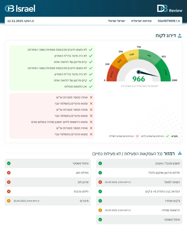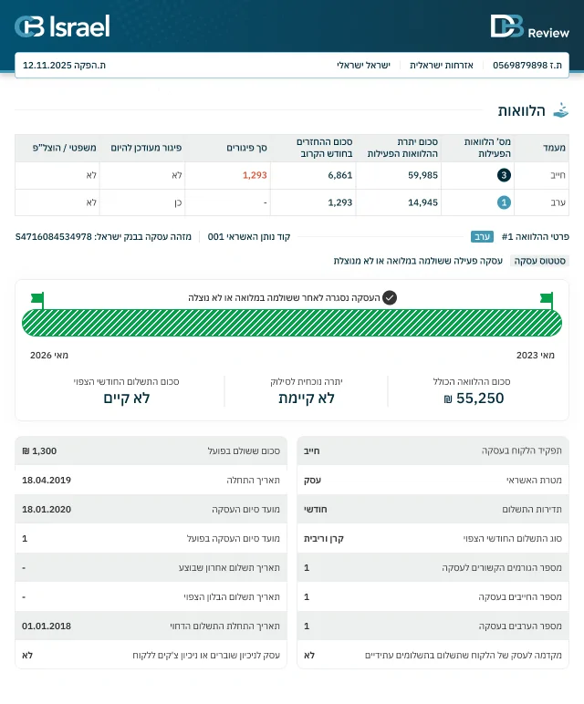
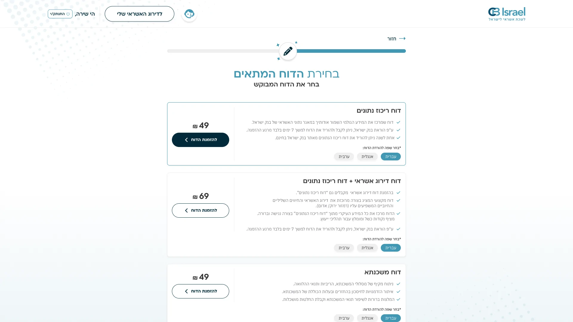

Behind the credit decisions made every day in Israel stand data, ratings and financial reports. Some of those reports pass through my design too. At Israel Credit Bureau, part of Dun & Bradstreet, I took part in the design refresh of the reports system and of the credit rating and indicator documents that bankers and credit advisers use in their daily work.
The need
Bankers and credit advisers in Israel use credit reports to review financial information and make professional decisions. These documents are rich in data, ratings, indicators and explanations, where every detail matters.
The challenge was to make this information more accessible and clear, so the important data can be spotted quickly, understood and explored in the relevant detail.
The work focused on two parts of the same experience: the system where reports are produced and downloaded, and the documents themselves, which stay with users throughout their work.
My work
On this project I took part in refreshing the design of the reports system interface and of the credit rating and indicator documents.
The work focused on organising the information, improving the visual hierarchy and creating a consistent design language between the system and the documents it produces.
In the reports we added infographics and visuals that help explain complex financial data, highlight what matters and connect the written explanations to the overall picture.
The goal was reports that don't just look good, but work as a clear, comfortable and useful tool for professionals who use them every day.
Giving complexity a clear structure
One of the interesting things about this project was the link between designing a digital interface and designing a professional document.
In both cases the challenge is similar: understanding what the user needs to see first, which data belongs together and how to let them move quickly from the big picture to the small details.
When a report is used in credit decisions, hierarchy, readability and visual precision matter a great deal too.
Expertise on this project
-
UX/UI Design
-
Financial Data Visualization
-
Report Design
-
Information Architecture
What I take from the project
There is something especially satisfying in knowing that your design work becomes part of a tool professionals use every day.
For me, this project shows the power of information design: taking a complex financial world, organising it clearly and helping people understand the data they need to do their work.